Theme Toggle
A small, theme-agnostic day/night/system picker for the Flarum 2 header. Drops into any Flarum 2 theme that respects the native <html data-theme="…"> signal (every theme that ships with or extends Flarum 2 does, including the default).



Screenshots
Desktop — header button
A compact icon button next to Search / Sign Up / Log In. The icon reflects the active choice (☾ dark, ☀ light, ◐ system).

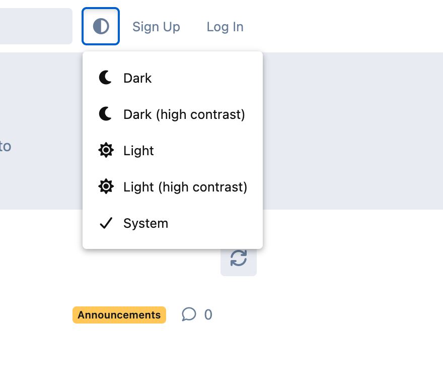
Desktop — dropdown open
Five choices, each with a matching icon. The active choice is marked with a checkmark.
Mobile — slide-out drawer
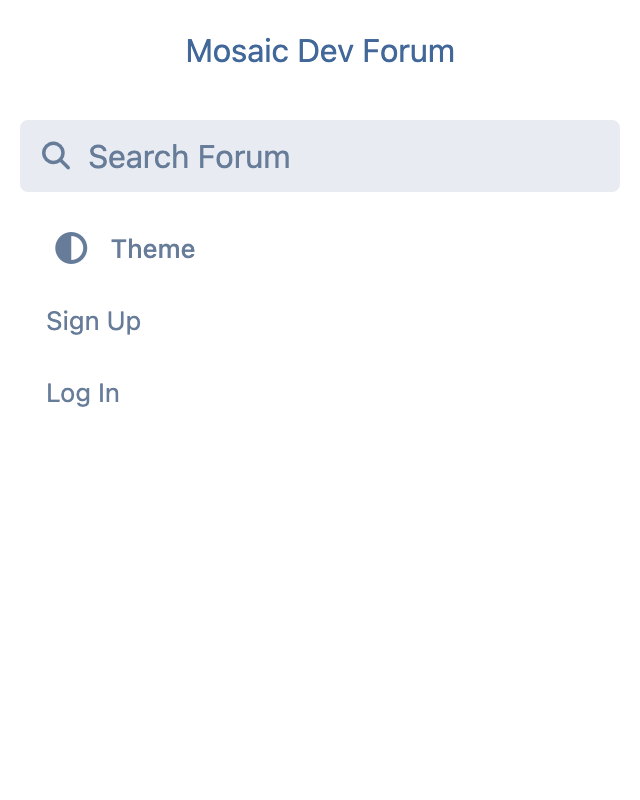
On phone-width viewports Flarum re-renders HeaderSecondary inside .App-drawer. The button switches to a labeled, full-width menu row so it lines up with Search / Sign Up / Log In.
Features
- Five choices. Dark, Dark (high contrast), Light, Light (high contrast), System.
- Native Flarum 2 signal. The extension only flips
<html data-theme="…"> and localStorage — no theme-specific CSS, so it composes with any well-behaved Flarum 2 theme (default, Aurora, or any third-party theme).
- System mode honours OS preferences. When System is active, the theme follows
prefers-color-scheme for light/dark and prefers-contrast: more for the -hc variants — so an accessibility user with macOS / Windows "Increase contrast" turned on automatically gets the right palette.
- Live OS updates. Changes to the OS theme or contrast preference are picked up immediately while the tab is open, with no reload.
- Persists per visitor. Your choice is stored in
localStorage under ernestdefoe-theme-toggle.choice and re-applied on every page load before paint, so there's no FOUC.
- Respects the admin default. Until a visitor explicitly picks a choice, Flarum's Admin → Appearance → Color Scheme setting is left untouched.
- Mobile-aware UI. Renders as a compact icon button in the desktop header and as a labeled
"◐ Theme" row inside the mobile slide-out drawer (where icon-only buttons would float disconnected from the surrounding Sign Up / Log In rows).
- Localized. All visible strings come from
locale/en.yml and can be overridden in your forum's locale files.
- TypeScript end-to-end. Sources are authored in TypeScript and type-checked against Flarum core's bundled
.d.ts files. npm run check-typings runs tsc --noEmit.
Compatibility
- Flarum core
^2.0
- PHP
^8.3
- Pairs with any theme. Tested with the default theme and the Aurora theme.
Install
composer require ernestdefoe/theme-toggle
php flarum cache:clear
Then enable Theme Toggle from the admin panel's Extensions page.
Development
cd js
npm install
npm run build # production bundle (writes js/dist/forum.js)
npm run dev # watch mode for development
npm run check-typings # tsc --noEmit, requires `composer install` at repo root first
The TypeScript path mapping in js/tsconfig.json points at ../vendor/flarum/core/js/dist-typings/, so composer install at the repo root must run before check-typings can resolve flarum/* imports.
Project layout
extend.php Flarum extension bootstrap
composer.json Package manifest
locale/en.yml User-facing strings
less/forum.less Header + drawer styling
js/
forum.ts Webpack entry point
tsconfig.json Extends flarum-tsconfig
src/forum/
index.ts Initializer + HeaderSecondary hook
theme.ts Choice/storage helpers + media listener
components/ThemeToggle.tsx The Dropdown component
dist/forum.js Compiled bundle (committed)
screenshots/ Images in this README
How it works
Flarum 2 ships four data-theme values: light, light-hc, dark, and dark-hc. Themes are expected to define their dark tokens as the default and their light tokens under [data-theme^='light'], with a high-contrast layer under [data-theme^='light-hc'] / [data-theme^='dark-hc']. Because those selectors use ^= (prefix match), setting data-theme="light-hc" activates both the regular light palette and its HC overrides via the cascade.
This extension just sets that attribute client-side:
- On boot,
theme.ts reads the saved choice from localStorage and writes the corresponding string to <html data-theme="…"> before the initializer runs, so the page never paints in the wrong palette.
- The
ThemeToggle component reads the same choice for its icon and dropdown state.
- When the user picks a new option, the choice is written to
localStorage, <html> is updated, and Mithril redraws the button.
- In System mode, a
matchMedia listener for prefers-color-scheme and prefers-contrast: more re-applies the choice live.
No theme-specific CSS, no setting payload, no server round-trip.
Translations
Override any string by adding the matching key under ernestdefoe-theme-toggle.forum.toggle.* in your forum's locale file:
| Key | Default |
| ------------------------- | ------------------------ |
| label | Theme |
| option_dark | Dark |
| option_dark_hc | Dark (high contrast) |
| option_light | Light |
| option_light_hc | Light (high contrast) |
| option_system | System |
License
MIT © Ernest Defoe
